
Crafting a library for Care
As a designer on the Cookbook systems team, I partnered with the Care product team to help them craft a care-specific component library. As I became familiar with the team and their needs, it became clear that the components in our Cookbook core library were not fully supporting their day-to-day work. The Care product lived somewhat outside of the Grubhub ecosystem and while they could pull flexible components like buttons and links, more rigid components didn’t adapt well to the Care experience. Before I hopped on, the team had already done wonderful work of documenting their pain points and more specific needs.

Role & timeline
I took lead on this project from the systems side and partnered with two product designers from the Care team. I worked with the two designers to facilitate handoff to the Care team developers.
To date, I’ve built and written documentation for eight components and three working strategies. This ongoing project has been in the works for about 3 months.
Discover
Thoughtful curation
As I started meeting with the Care designers, it became clear that they were feeling some discomfort. As a team, they had already taken the time to corral their ideas and existing documentation into a Figma file. This document really helped me to ask the right questions and better understand their needs.

Remote collaboration
With both of my Care partners located in New York and everyone home due to covid, finding an effective way to collaborate was our first priority. We fell into a comfortable flow, using tools like FigmJam, Slack, and Loom to stay connected. Personally, I really enjoyed getting Loom videos and seeing their face as they described ideas.
Learning together
As a newer designer at Grubhub, I was still working to get the ins and outs of the system logged in my brain. Building out this library alongside the Care designers gave me the opportunity to learn the overall system but also to put that new knowledge to use as I helped to guide and educate the Care team on Cookbook.

Design & Documentation

Cookbook alignment
Through the process of building the components, I worked with the team to identify areas of opportunity to bring the current components closer in line with the core Cookbook library.
This included things like using the Cookbook type styling and header structures, using more prominent interactive icons, bringing content into left alignment and taking advantage of our defined elevation and dimension styles.

Structure and organization
As this was functionally meant to be a sub-library of the Cookbook core, we decided to utilize the same organizational structure. As of now, we don’t have a living reference site so everything lives in Figma. We use Figma’s built-in prototyping to streamline navigation and make it function similar to a working reference site.
Similar to Cookbook core, each component has its own page, which allows designers to browse and pull assets and their variations into design documents. Separately, there is a documentation and strategies section which allows both designers and developers to access best practices and component specs.

Strategies
In addition to documentation for each component, we also create strategy documents that describe how components should be utilized throughout an experience. For Care, we currently have 3 strategies, disclosure, navigation, and interactions.
The Care team doesn’t always have dedicated designers, so strategies help with future onboarding but also serve as a reminder of decisions that have already been made or are already working well within the experience.
The Care strategies cover interactions like serving up follow-up questions, creating consistent navigation flows and guidelines around number of options to present to the care agents.
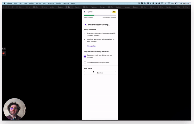
Putting Figma to work
Previous to my work at Grubhub, I had used Sketch as my primary design tool. Getting up to speed with Figma was a great experience and really sped up component creation.
Using the built-in variant and property functionality allowed me to create one component in a number of different flavors and structures.
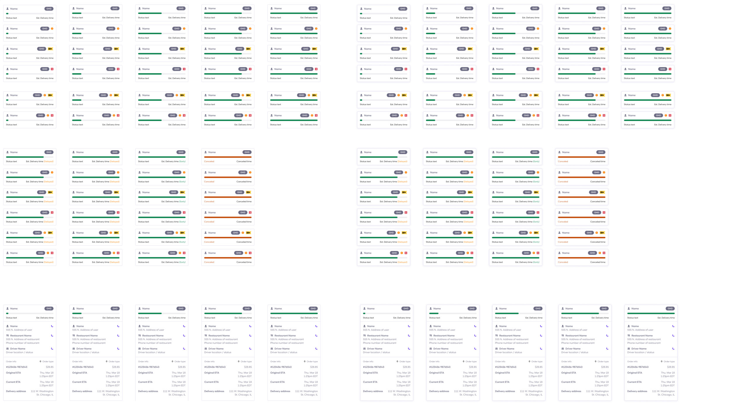
Care’s Persistent Order Reference component was the most complex in this library. It included almost 230 variations, with both a closed and opened state.
However, on the front end, designers saw only a few customization controls, allowing them to access all of these variations by simply flipping a few switches.
Ongoing support
The Care library is a living document that is always changing. I meet with the Care designers weekly to discuss ideas for improvement, to make adjustments, and keep up with ongoing projects and initiatives.
My overall goal for the Care library is to identify components that are good candidates to be graduated into the Cookbook Core library. Thinking about these components more globally may unlock some opportunities for broader reusability across Grubhub and not just for Care.
Conclusion
For the time being, the current structure is working and designers and developers are happy with the progress made. I believe there is a lot of room for improvement in regards to system structure at Grubhub and I hope that the work put into the Care library can help push that along.
Historically, the Care team had felt that they were not receiving the same level of support as more public-facing products. My hope is that this project pulls them up into the conversation and gives them a better seat at the table as far as design systems contribution is concerned.